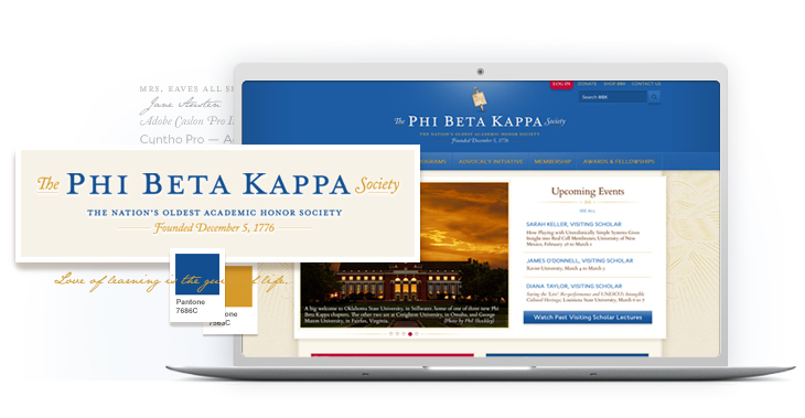
Phi Beta Kappa's New "1776" Look
The nation’s oldest (and arguably most prestigious) honor society needed a refresh for its existing website. We gave them a lot more.

As TerpSys worked with The Phi Beta Kappa Society (ΦBK) to freshen up its site, TerpSys began to see opportunities to align its 237-year-old brand with web design work already underway. During the process, TerpSys collected old versions of logos, fonts, color palettes and iconography, as well as a bit of ΦBK history, and crafted a logo re-design ready for the new site launch — all within Phi Beta Kappa’s website budget.
As a result, TerpSys was later asked to design a logo for a vast new ΦBK project, the National Arts and Sciences Initiative. With an already intimate knowledge of the ΦBK brand, the TerpSys team over-delivered on ideas in record time.
TerpSys helped The Phi Beta Kappa Society define the strategy and implement a complex application which included:
- Consistent and Coordinated - TerpSys supplies logo customers with a package of file types for a variety of sizes and uses. Phi Beta Kappa can now keep a consistent, organized impression throughout its communications with members and prospective members.
- Leveraging Brand Equity – Sticking closely to and respecting brand history, TerpSys created a new set of files that, to ΦBK’s loyal following, seems like polished, contemporary versions of what they’ve seen for years.
- Uniting Stakeholders - Before, ΦBK’s colors might have depended on who you asked. TerpSys was able to take diverse opinions and turn them into a concise palette, both vibrant and rooted in the past, pleasing a large and varied committee of stakeholders.